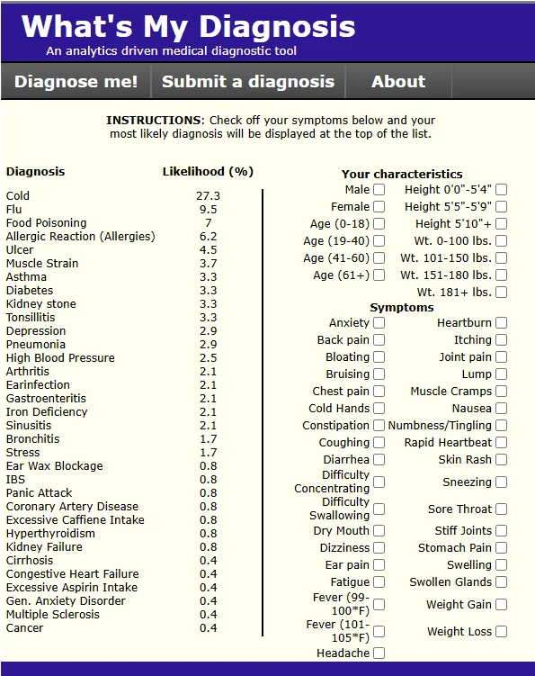
likelihood %
Symptoms
More Symptoms, Findings & Tests?
This is a rebuild by Jack Bellis, of WhatsMyDiagnosis.com, a beloved, long-abandoned web tool that was, and still should be the predominant diagnostic tool for consumers... and possibly professionals.
 Buy Me A Coffee
All of our websites are free, funded only by your small donations.
Where the numbers come from
- Baseline rates (the default list): each diagnosis's share of US doctor-office visits, from the CDC's National Ambulatory Medical Care Survey (NAMCS 2019) — 8,250 sampled visit records, survey-weighted to represent about 1.04 billion visits nationally.
- Symptom probabilities: how often each symptom appears as a reason-for-visit among patients receiving each diagnosis, tabulated from the same records.
- Age and sex adjustments: relative-risk multipliers derived from the same microdata (checking "Age 61+" nudges arthritis up because that's what the visit records show).
- The ranking math: naive Bayes — start every diagnosis at its baseline rate, multiply in the probability of each checked symptom, normalize to 100%. A smoothing floor (0.02) keeps rare symptom–diagnosis pairs from producing absurd certainty.
- The long tail († rows): 4,288 rare diseases from the Human Phenotype Ontology — 114,827 disease–phenotype links curated by medical geneticists from the published literature, each traceable to its source article, with frequency grades. They start at a deliberately tiny baseline and enter the rankings only when a typed symptom gives them evidence: rarity loses to specificity, exactly as it should.
- The receipts tier: likelihood ratios from the diagnostic-accuracy literature — chiefly the JAMA Rational Clinical Examination series — for exam and history findings no survey can hear (a third heart sound, tonsillar exudate). Every entry in the ledger carries its citation and study size, and each one is marked unverified until checked against the printed article. Evidence counts and receipts, never recommendations.
- Hand-curated fallback: diagnoses too rare in the survey sample (fewer than 30 visits — food poisoning, MS, cirrhosis, and the like) keep clinically-informed hand-set estimates. Every row in the source code is annotated with which kind it is.
- Honest gaps: weight-band effects are hand-set (NAMCS doesn't record patient weight), and both fever checkboxes share one estimate (it doesn't record temperature either).
Lineage
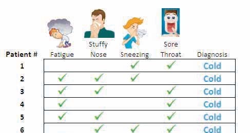
The original whatsmydiagnosis.com was created in 2012 by John Toczek, an operations-research professional and author of the PuzzlOR column in Analytics Magazine. The site was a proof of concept that went offline before its crowdsourced table could mature. This rebuild preserves his interface and his ranking idea, and seeds the matrix from CDC survey microdata instead of waiting for volunteers. His crowdsource-intake form is retired for now; if user-contributed evidence returns, it will return as a verified tier with receipts, not a suggestion box. Same soul, more data. Below is a sample of one of his works that seems to have informed WMD or vice versa.